Brief
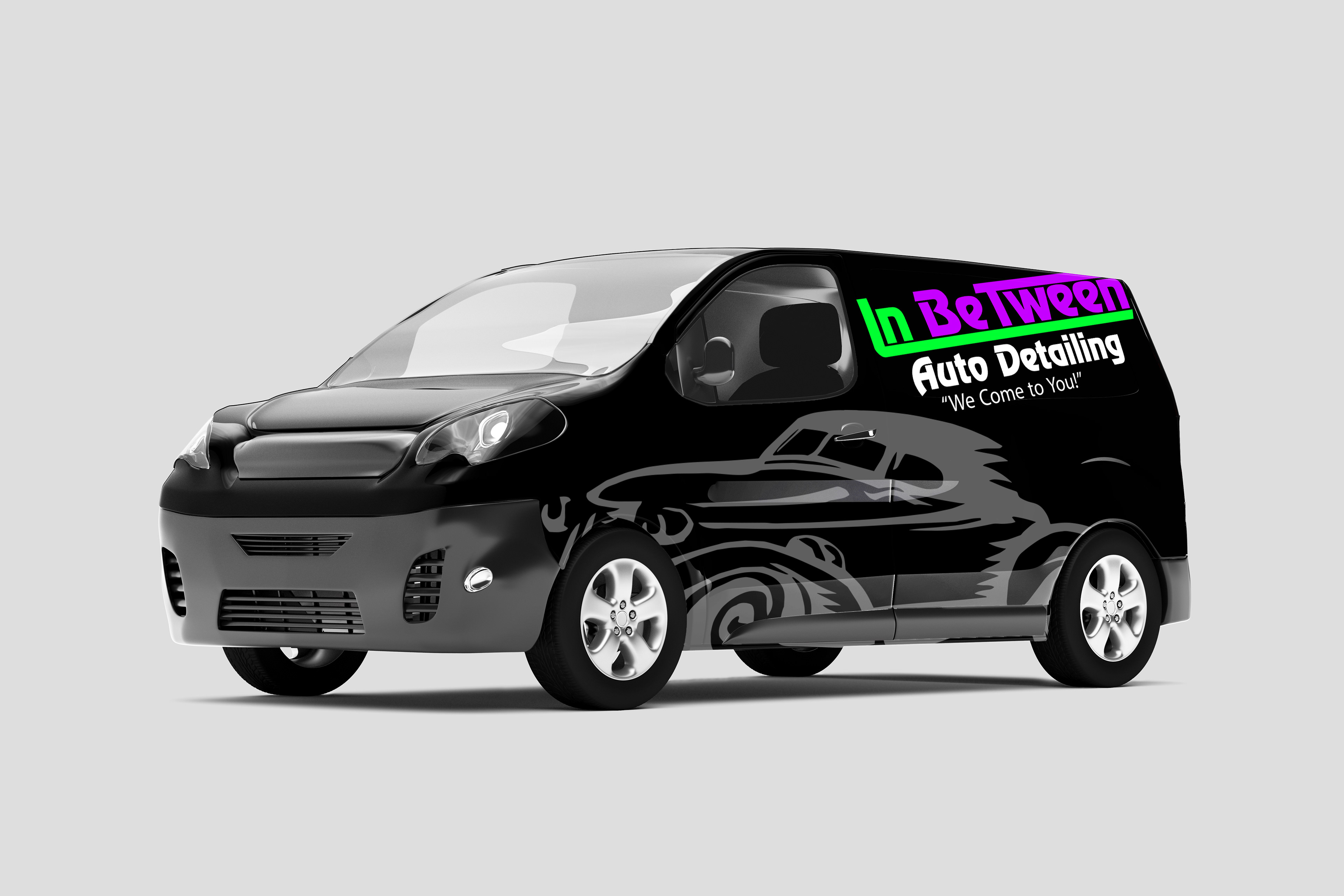
In Between Auto Detailing needed a brand that is pronounced, modern and visible from a distance. This is a small company that provides mobile auto detailing services to an upscale clientele. They wanted to use their work vans as portable billboards, so they needed to be recognizable from several blocks away.
Objectives
To create a logo that is recognizable from a distance.
To create a brand that communicates class with a modern edge.
To appeal to an upscale clientele and car enthusiasts.
Solution
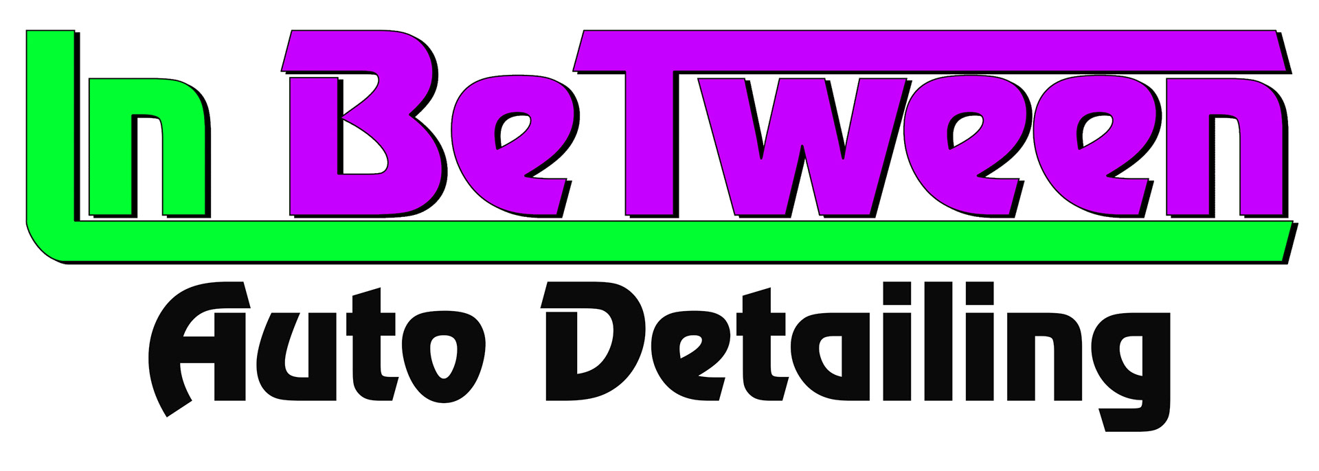
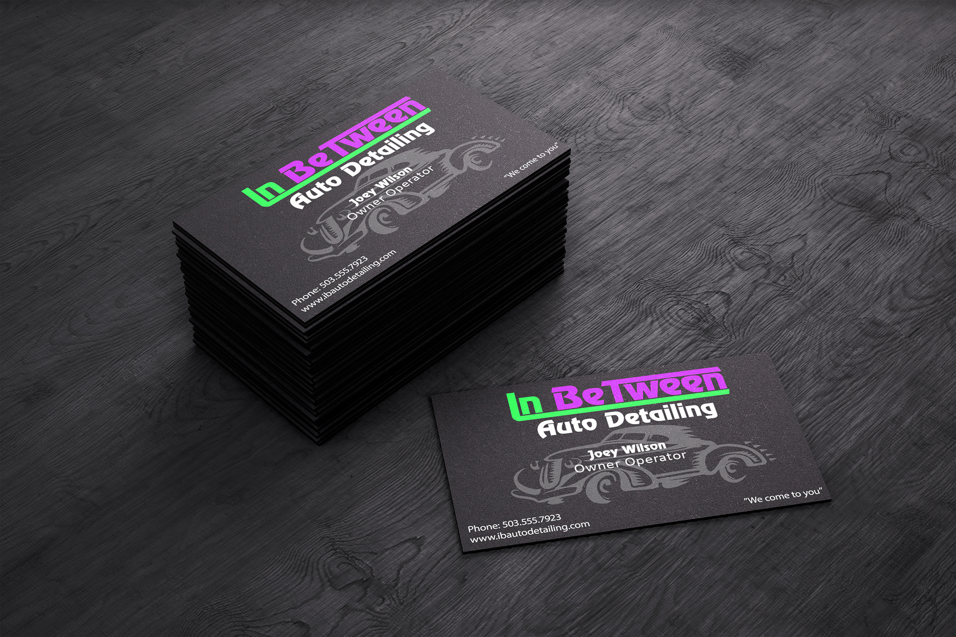
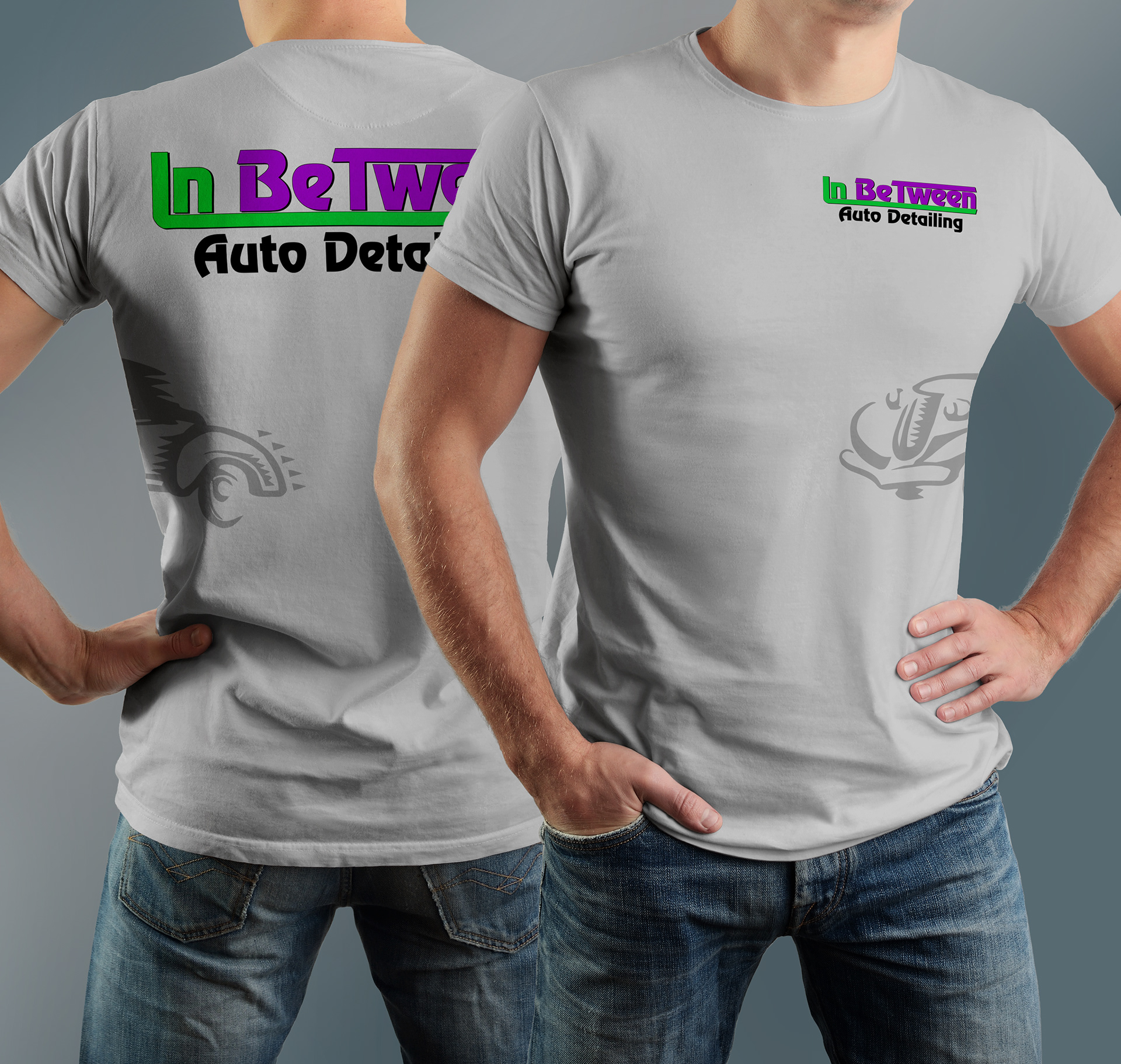
The logo for this brand is primarily a wordmark. By extending the top of the “T” and the bottom of the “I” to the end of “Between” I created both a play on words and a sense of motion or mobility. The choice of colors along with the bold text make this logo pop on a black or white background.
Added graphical element is the illustration of a classic style car. This design element helps to appeal to the higher-end customer base. This element also conveys speed and mobility